Oh wow, clear contender for a winning entry here! Not only a creative idea but so flawlessly made, and presented, and everything. From the photo angle to the corner signiture to: the actual cubicles themselves. Really cool work.
-cd-
3,136 Art Reviews w/ Response
All 11,063 Reviews
jagondudo responds:
Thanks, mate! Here's hoping!
It does look pretty detailed! Reference seems like it'd take time to research and understand but.. I really like the color. The form of the galaxy's almost like a spinning top. Nice work.
-cd-
Kamikaye responds:
Thanks ! I can only recommend the book. It's really good and different scifi !
As always there's so much detail! :D Where do you get the time to draw all of these... and play games, by the looks of all your inspirations. :) impressive work. I like the unconventional world view/cycle of time, and a lot of details to look at. Also unusual with a B/W piece.
-cd-
ScepterDPinoy responds:
I originally going to make an non isometric rpg mockup but decided to make a traditional paper styled minit fan art when I had an idea last Friday. I did this on Sunday in 6 hours.
It really looks more like city lights and traffic with this one though, buildings looming in the background. :) Seems that might the footage it used, or is it just a really clear illusion? Gets me wondering about the previous ones, if maybe they were all composed of similar photos... for some reason I'd figured they were all digital, bordering on a photo-like effect, but maybe it's the other way around... either way really cool. Though this one feels a bit more hectic than the others.
-cd-
OrangeWedge responds:
Some are completely recreated in digital (like the previous one), some start with some stock footage, like this one.
The important part is the middle-process :)
Like riding the rainbow roads in Mario Kart on shrooms. :) Not that I'd know what that'd look like, but I imagine it might be something like this... what a trippy but awesomely colorful and ambient spiral.
-cd-
OrangeWedge responds:
Thanks man!
Stay tuned, by the way.
I'm uploading an other artwork later this evening.
So this is you. :) What a randomly creative nickname hmm... an affinity for avocado? Green hair? Lazy demeanour? I'm curious how the name ties in to the real life counterpart! Similar to the Fire Fox it's a nicely simplistic piece, and I like the texture, and the font... well I wonder if there's not something that suits it better still! Cool idea with seed as nose.
-cd-
smaxit responds:
My friend loves avocados so I brought her oe, as I visited her at the hospital. She ate it and gave me the left overs (two halfs of the shell). I don't know why but I thought it'd be a good idea to use one half as a nose. I dried the half, glued a threat to it and wore it the next time I visited her as some sort of "mask" (It looked like a coala nose). She nearly fell out her bed laughing ^^
After that she started to call me avocoala - because of the Avocado-nose and my big ears
Pretty realistic form! In a... strange charicaturish type of way? Looks good though.
-cd-
PocketIllust responds:
Thank you, stranger! I try my best! :D
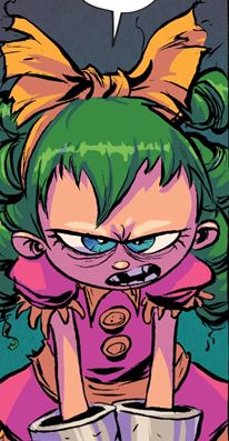
Not really seeing the appearance of a child. :) But yeah, tempting indeed! Looks like a women who might get her way... nicely drawn.
-cd-
StewsSpicyBlog responds:
Oh, Queen Cloudia here is referring this insane hyper-violent 38 year old (with the appearance of a child) https://vignette.wikia.nocookie.net/imagecomics/images/c/cd/Gertrude_I_Hate_Fairyland_001.jpg/revision/latest?cb=20151015114517
An unexpected love blossoms. :) Pretty nice. I like the color and characters but... not sure about the fuzzy outlines. IMO it seems more like a lack of effort than part of the style. On one hand it could've looked like fur, but when the background shines through the fur within the outlines... kinda rushed.
-cd-
smaxit responds:
To be honest I tested my new brushes for my art program and thought it looked quite nice for a test. I know I could have done better. Maybe I'll do this piece again but with more effort and time. :3
Ah I remember this contest! :D Pretty smooth work with the coloring, and realism in the textures especially, though it looks like it was filled. The color doesn't really flow with the motive, or go out into the edges. Everything's within the lines. Good fills, but not much more than that.
-cd-
smaxit responds:
I know right! I entered the contest too late in the end... Had to rush through this because I got sick the week before the deadline and then tried to finish it in 4hours... You can tell, cant you?
It's one of the many pieces I rushed through and regret doing it....
Bamboo Shoots!
Age 35, Male
Poet/Designer/Etc
ACCOMPLISHED
Sweden
Joined on 1/17/04


- Rank:
- Sup. Commander
- Global Rank:
- 6
- Blams:
- 33,510
- Saves:
- 253,653
- B/P Bonus:
- 60%
- Whistle:
- Deity
- Trophies:
- 44
- Medals:
- 11,359
- Supporter:
- 12y 5m 1d
- Gear:
- 11